Turing clouds - how they work
These are some of the ideas and other systems that went into creating Turing clouds.
Alan Turing’s original model
After Alan Turing had established the foundations of computer science and helped break the German Enigma cipher during World War II, his interest turned to biology. One of his last published papers was titled “The chemical basis of morphogenesis” (PDF here). This paper proposed a model for how biological systems might develop striped or spotted patterns, such as those you see on a zebra or a leopard.
To get the basic intuition behind Turing’s model, imagine a flat surface with two chemicals, an “activator” and an “inhibitor”, diffusing across it at different rates. The real-world analogue of this would be something like the skin of a growing animal. In locations where there is more of the activator than the inhibitor, the activator creates more of itself as well as more of the inhibitor, and it causes pigmentation, such as a black spot or a stripe. In locations where there is more of the inhibitor than the activator, some of each is destroyed, and no color change happens.
Turing showed that this simple interaction of chemicals should lead to regularly spaced patterns, with the details of the patterns depending on the exact diffusion rates. As of 2019, we don’t know of any biological system where Turing’s model has been conclusively shown to be the source of such a pattern, but the model has been demonstrated to produce patterns in a chemical system.
Jonathan McCabe’s multi-scale patterns
In 2010, Jonathan McCabe wrote a paper describing a simple way to simulate Turing’s model on a computer. The paper also described a tweak to that model which leads to startling visual patterns.
The simulation follows the general format of a reaction-diffusion system, and even more fundamentally, a cellular automaton. Create a grid of numbers, where each entry in the grid has a value between -1 and 1. The value can be thought of as the difference between the amount of activator and inhibitor chemicals at that grid location. The system evolves from one timestep to the next by simulating diffusion and then modeling the reaction of the diffused chemicals.
To simulate diffusion at a given cell, take the average value of all grid locations within a fixed radius of that cell. Averaging over a larger radius corresponds to having a faster diffusion rate, because there are more cells contributing to the new value. In the Turing reaction, activators and inhibitors diffuse at different rates, which corresponds to taking averages over different radii.
To model the reaction, take the difference of the newly calculated averages from the activator and the inhibitor. If the result is positive, increase the current cell’s value slightly, and if it’s negative, decrease the cell’s value slightly.
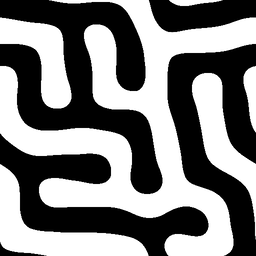
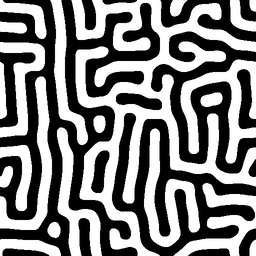
Once this has been done for all cells in the grid, the image can be generated. Color each pixel in the image based on the corresponding cell’s new value: a value of -1 yields a black pixel, +1 yields a white one, and anything in between uses the corresponding greyscale value. Here are a few examples of this kind of system:
 |
 |
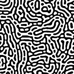 |
McCabe also suggested that you could simulate more than one of these reactions on a given system at a time, using different radii for each reaction. If you do this, and you add the results together, you can get patterns that look like stripes made of spots. But he also observed that a slight tweak to this approach gives a much more visually striking result. Instead of simply adding the results together, his system updates the value of the cell based on which pair of radii has the smallest difference. This seems to constantly add instability to the system, and it yields images with fractal-like detail and a strong biological character. Here’s a characteristic example that uses nine pairs of radii:
Thinking about speed and color
I was captivated when I first discovered this system. As with the Mandelbrot set back in the 1990s, I found it amazing that such a simple system could generate such visual complexity. But this system would have been unusably slow to implement back in the days of Fractint. A naive calculation of a single timestep takes an amount of time proportional to the image’s width, times its height, times the square of the largest radius; and the largest radius can be a substantial fraction of the image’s width or height.
Even on a modern computer, this isn’t a fast operation. The first implementation I found, which was in the reaction-diffusion modeling system Ready, only generated a few 512x512 images per second on my laptop. It takes quite a while to watch the system evolve when it’s crawling along at that rate. So that got me to start writing my own implementation, first as a multi-threaded CPU-based program, then once again as a GPU client using OpenCL.
As I was working on my version, I started wondering what this system would look like if it were colored - or, for that matter, what it would even mean to try to add color to it. One of my early attempts was vaguely reminiscent of a lava lamp:
which was fun, but ultimately not all that satisfying. Eventually, the ghost of Claude Shannon tapped me on the shoulder and pointed out that I wasn’t going to get the full range of colors in a three-dimensional color system if I only had one value per pixel.
I read a blog post by Jason Rampe about an approach he’d taken to colorizing multi-scale Turing patterns. I liked how they looked, but he pointed out that his method is much better suited for single-frame images rather than movies, because it changes drastically from frame to frame. Since I had already been aiming at creating an implementation that could create smoothly flowing images, I decided to look for something new.
Adding color by using vectors
I wound up creating a very straightforward extension of the multi-scale algorithm, where each cell has a vector of data rather than just a single value, and the multi-scale algorithm is reinterpreted to use vector arithmetic. This gave me a three-dimensional vector, contained within the unit sphere, that I could try to turn into a color. But I was disappointed to find that I couldn’t find a way to make those values look good, even after converting them into spherical coordinates which would fit the data more naturally. The radius, which is the analogue of the single value used to generate black-and-white Turing patterns, was too visually dominant in the vector version to be compelling. On the other hand, if I didn’t use the radius, I’d only have two values to work with.
So I tried four-dimensional vectors. Although that gave me enough data to wander through a 3-D color space, I was still reluctant to discard the radius, since without it the images looked totally unlike the black-and-white multi-scale patterns that I started with. But ultimately I decided that what I found was more compelling than a colorized version of the original pattern, and I stuck with it. Here’s an example:
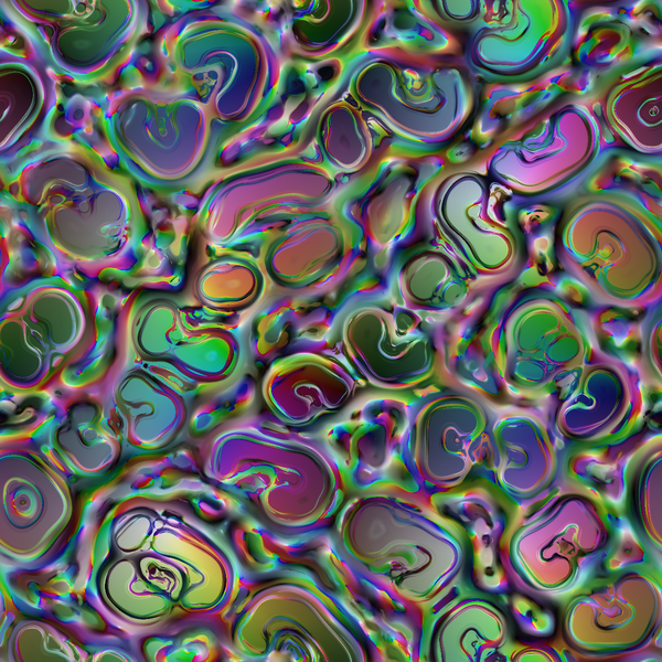
If you’re curious exactly how the colors are generated from the 4-D data, the code describes it in detail. The summary is that I convert the 4-D data point into hyperspherical coordinates, use the angles from that coordinate system to generate values between 0 and 1, and use those to set the HSV values of the pixel.
Heatmap visualization
As I was playing with different ways to turn a vector into a color, I had several occasions where I wanted to look more directly at the data. Simple histograms of each axis didn’t tell me very much, so I made a 2-D “heatmap” by projecting the 4-D data onto a plane, and using the pixel color to represent how many 4-D data points mapped onto a given point in the plane. Not only was this a useful debugging tool, I quickly noticed that it was at least as visually interesting as the color rendering itself. The 4-D object that it shows bears some resemblance to a strange attractor, but it also shifts around in space as the system evolves. The shifting, complex shape of these objects inspired the name “Turing Clouds”.
Here’s what the previous image looks like in heatmap mode:
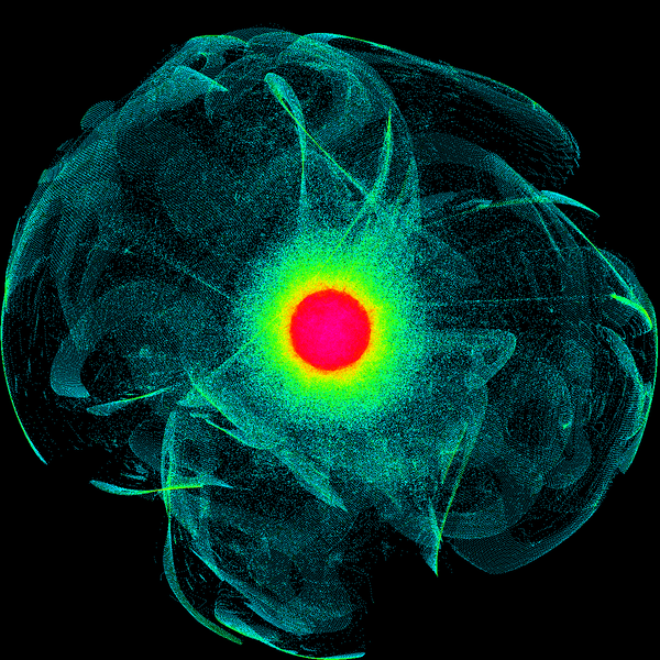
The ravioli-like shapes from the color rendition are visible as thin films within the overall cloud of data.
Interacting with the data
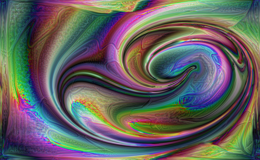
During the development of my GPU-based implementation, I came across a paper by Aubrey Jaffer titled “Oseen Flow in Ink Marbling”. It describes the dynamics of a system where a finite-length stroke is made within a viscous liquid, such as what you might do when creating ink marbling patterns. This seemed like a fun way to interact with my visualization, so I implemented support for it. It treats mouse movements as strokes, and the result can wind up feeling like finger painting using very surprising colors. Here’s an example, created by drawing a few spiral strokes in an existing image:
I’ve also added support for capturing an image using a connected camera, and letting the system evolve starting at that image. The results can be a bit uncomfortable to look at!
There are several tunable parameters involved in generating an image. They can each be controlled by individual keystrokes, but there is also an “autopilot” mode running by default which tweaks the parameters occasionally to keep the display interesting.
Speed
As mentioned above, I had a goal of making my software run fast enough that I could interact with it in real time. It takes some decent graphics hardware to make that happen, but I’ve achieved it. The software can render full HD (1920x1080) at 15 fps on an AMD Radeon 570 (such as this eGPU), and at 20 fps (very nearly 30 fps) on an NVidia 1060. These are both fast enough to be fun to interact with. A 2016 MacBook Pro can get around 5 fps running full-screen with its built-in graphics hardware, which is just fine for development and experimenting.
Back to the main page.